Pie Chart
A Pie chart is a circular graphical representation used to show the proportion or percentage of different categories within a whole. Each "slice" or "segment" of the chart represents a specific category, and its size is proportional to the amount it represents within the total set. These charts offer a variety of customization options that users can configure to adjust the appearance and functionality of the chart according to their needs. These configurations can be found in the Menu option. The following sections will detail these options:
STYLE
The options vary depending on the type of chart. In the Pie chart, the user has the following option in the "STYLE" section.
| Options | Values | Description |
|---|---|---|
| STYLE | Pie/Donut | This option allows the user to choose whether the charts will be displayed as pie or donut graphs. |
LAYOUT
The options vary depending on the type of chart. In the Pie chart, the user has the following option in the "LAYOUT" section.
| Options | Values | Description |
|---|---|---|
| CONTENT ARRANGEMENT MODE | Auto/Fixed Rows/Fixed Columns | This option allows the user to manage the arrangement of the cards and offers the following three modes: Auto - Automatically adjusts the pies to fit within the dashboard item. Fixed Rows - Allows you to arrange the pies in a set number of rows. Fixed Columns - Allows you to arrange the pies in a set number of columns. |
| LINE COUNT | Insert a value | This option allows the user to define the number of rows or columns, which is reflected in the Pie dashboard. |
LABELS
The options vary depending on the type of chart. In the Pie chart, the user has the following option in the "LABELS" section.
| Options | Values | Description |
|---|---|---|
| DATA LABELS | Select a value | This option allows the user to select the values displayed in the data labels. |
| TOOLTIPS | Select a value | This option allows the user to select the values displayed in the tooltips. |
| DATA LABELS POSITION | Outside/Inside | This option allows the user to display data labels inside or outside of pie chart segments. |
COLORING
The options vary depending on the type of chart. In the Pie chart, the user has the following option in the "COLORING" section.
| Options | Values | Description |
|---|---|---|
| AXIS Y | Auto/Off/On | This option allows the user to define how colors will be applied to the segments of the Pie Dashboard based on the values of the argument. It contains three options: Auto - Automatically assigns different colors to each argument using a predefined palette. On - Activates coloring based on the arguments and allows additional customization configurations. Off - Deactivates coloring based on the arguments; all segments are represented with the same color. |
| SERIES | Auto/Off/On | This option allows the user to define how colors will be applied to the segments of the Pie Dashboard based on the data series. It contains three options: Auto - Automatically assigns different colors to each series using a predefined palette. On - Activates coloring based on the series and allows additional customization configurations. Off - Deactivates coloring based on the series; all segments are represented with the same color. |
| MEASURES COLORING | Auto/Off/On | This option allows the user to define how colors will be applied in the Pie Dashboard based on measure values. It contains three options: Auto - Automatically assigns different colors to each measure using a predefined palette. On - Activates measure-based coloring and allows additional customization configurations. Off - Deactivates measure-based coloring; all metrics will be represented with the same color. |
COLOR SCHEME
The options vary depending on the type of chart. In the Pie chart, the user has the following option in the "COLOR SCHEME" section. This option allows the user to edit the colors of the specific palette for the selected color scheme type.
| Options | Values | Description |
|---|---|---|
| DIMENSIONS | Global/Local | This option provides the client with two choices for coloring dashboard item elements: Global - Applies consistent colors for identical values throughout the dashboard. Local - Utilizes a unique set of colors for each individual dashboard item. |
How to Apply the Settings of the 'Menu' Option
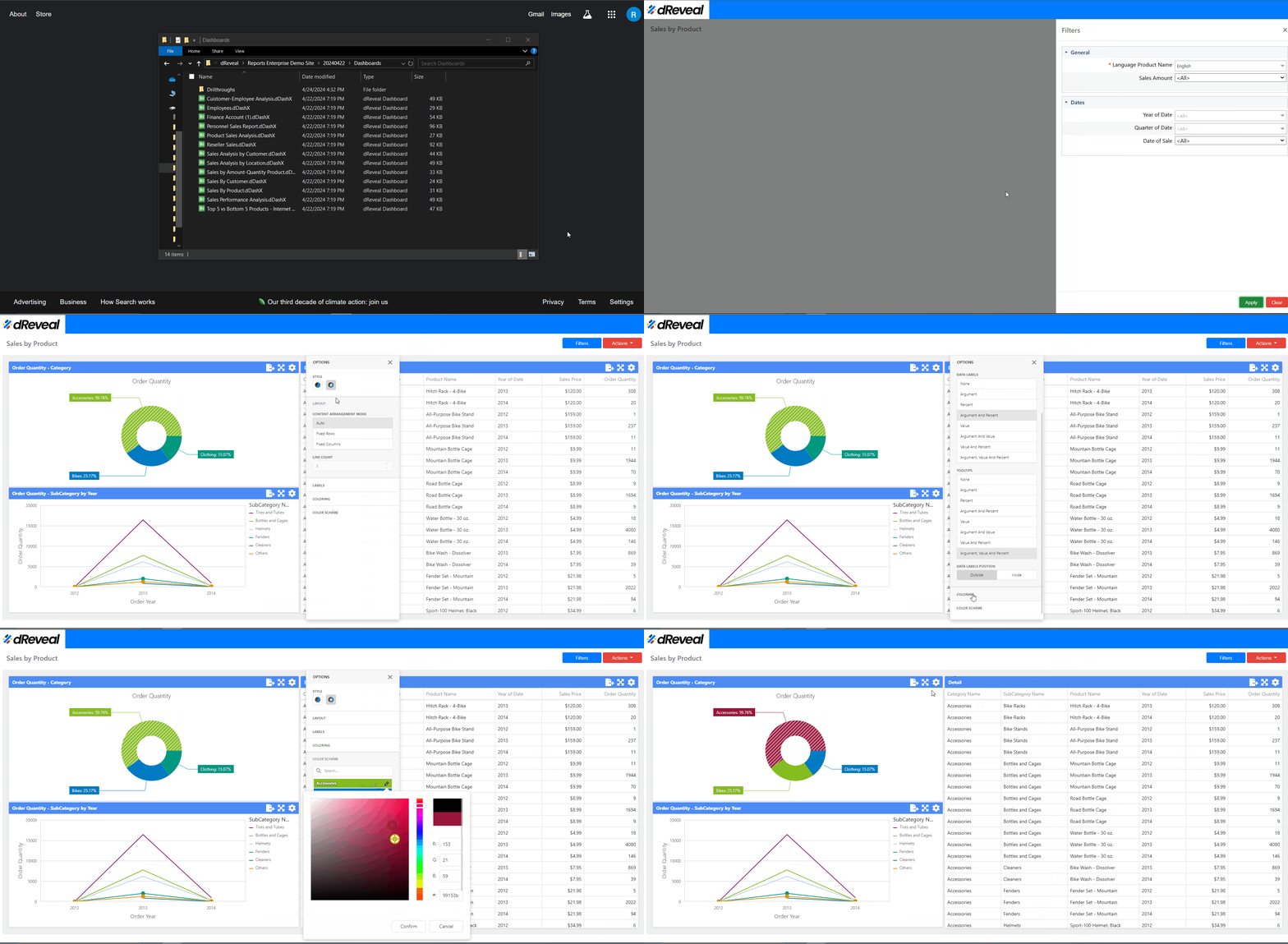
Navigate to the report you want to run, select it, and drag it to your web browser where dReveal Lite is installed. Next, click the Apply button to display the report. Once the report is loaded, locate the pie chart you want to modify, click on the Menu option located at the top right of the chart; the icon is a gear. The available options for configuring the chart will then be displayed.
Pie Chart

